VALUE: The Visual Component - Part 2

"I don't paint things. I only paint the difference between things."
Henri Matisse
In Part 1 of this series, we defined Value as the foundation of how we read images. But for a creator, Value is more than just a scale: it is a tool of command. You do not "capture" the light you see; you dictate it to serve your vision.
To control your compositions, you need to understand the three visual components that structure every image: Line, Mass and Form.
The same concept goes by many names: Mass is often called Notan, shapes, local value, dark vs light... Form can be called chiaroscuro, light vs shadow... it can be so confusing. We are taking the terminology that Bill Perkins uses. You can check his online school here.
The Language of Line
Strictly speaking, a line does not exist in nature. You cannot reach out and touch one. What we perceive as lines are the places where two planes meet, where one shape ends and another begins, where a form has an axis, where movement leaves a trace. Line is the most abstract of the three elements, and also the most immediate: the moment you look at anything, you are already reading its lines.
In composition, line operates on two levels. As a visual component, it is what the eye traces through a scene: the edge of a building, the silhouette of a figure, the ridge of a nose, the horizon dividing sky from ground. Everything that has direction, boundary, or axis contributes to the linear reading of your image. As an element of design, line describes surface. A cluster of marks within a boundary creates texture. A stroke whose width varies from thick to thin implies a light source. These lines do not exist as outlines; they are the built-up visual information of a surface.
This has a direct consequence for anyone working with light. A line only appears where there is tonal or color contrast at an edge. An evenly illuminated surface has no lines; they dissolve into uniformity. A shadow falling hard across a wall creates one instantly. And the character of the edge determines the character of the line: a sharp, clearly defined contrast reads as a firm, assertive boundary. Soften the transition and the line becomes tentative, atmospheric, implying depth rather than stating it. Push that softness all the way until two adjacent values merge and the line disappears entirely. When you decide how to light a scene, you are deciding which lines exist, how decisively they announce themselves, and which ones quietly vanish.
Direction carries emotion. Horizontal lines read as rest and calm: the horizon, a sleeping figure, still water. Vertical lines suggest stability with latent energy: a standing column is balanced, but it could fall. Diagonal lines carry action; the steeper the angle, the more energy the image holds. Beyond direction, the quality of a line matters. Straight lines feel direct and tense. A gentle curve has flow. A vigorous curve carries force. The zigzag, with its sudden reversals, reads as agitated. Your frame itself is the first linear choice you make: a wide horizontal format settles the eye before anything is placed inside it; a tall vertical one introduces tension from the start.

A line-dominant composition makes its statement through edges and silhouettes. The identity of the image lives in its contours before lighting enters.

Horizontal lines suggest rest. Vertical lines carry potential energy. Diagonal lines bring action. Every direction is an emotional choice.
Finally, Line dominance is a valid strategy, just as Notan and Form dominance are. A line-dominant image makes its primary statement through edges and silhouettes, before any lighting enters the picture. Think of ink drawings or woodblock prints: the visual identity lives entirely in the contour, and any color or shading added on top is secondary. The same rule applies here: you cannot ask Line, Notan, and Form to compete at full intensity simultaneously. One must lead. The others must serve.
Understanding Notan
Notan is a Japanese art concept that translates to "Dark Light Harmony". It is about the relationship between dark and light values in any image and how they balance against each other to give it structure. Paintings, photographs, prints… we will dedicate a future post to it.
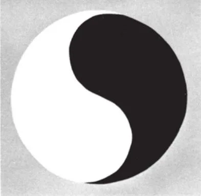
The Yin and Yang symbol is one of the most recognizable representations of Notan: the balance of dark and light.
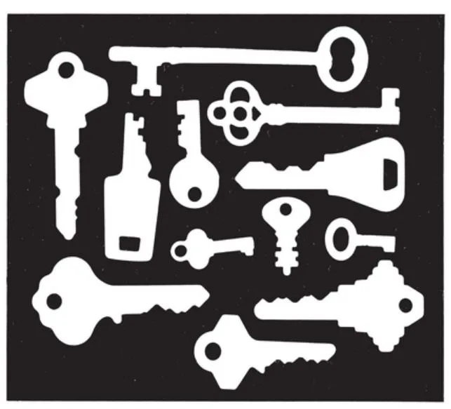
The holes in the keys create a visual rhythm against the varied spaces between them. This interplay of solid and void is Notan at its most elemental.
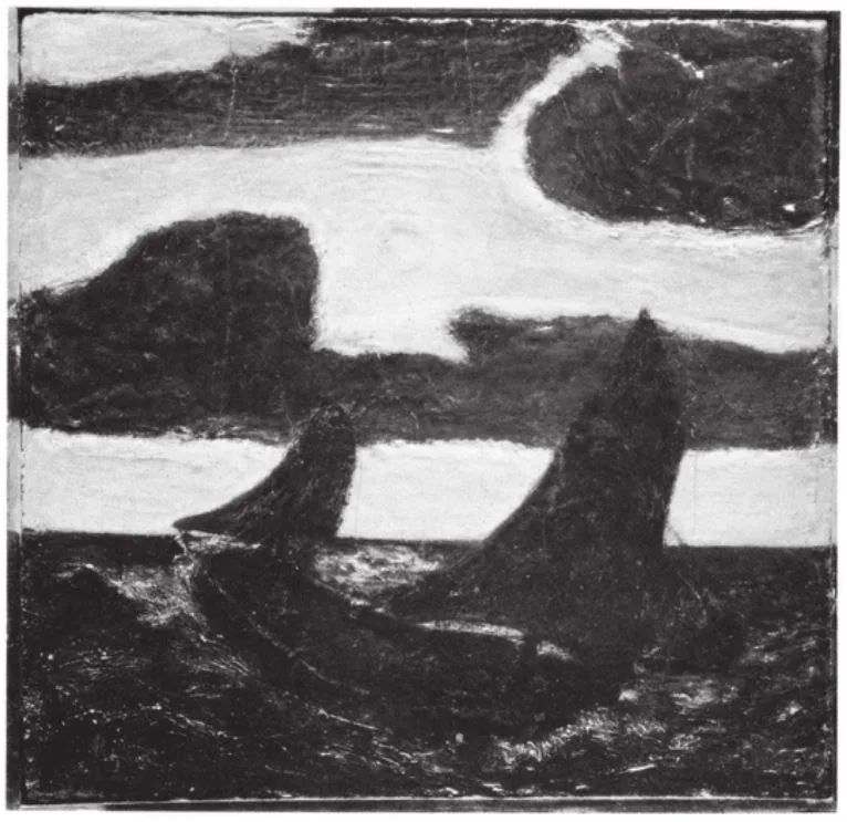
Moonlight Marine, Albert Pinkham Ryder (The Metropolitan Museum of Art, Samuel D. Lee Fund, 1934). The exchange between the moonlit sky and the dark clouds rocks the eye back and forth, making us feel the movement of the sea-swung ship below.
Rooted in the Yin and Yang, Notan treats light and dark as complementary forces, not opposing ones. The ideal is 50/50 balance, whether through symmetry (mirrored shapes) or asymmetry (different shapes, equal visual weight).
"Careful distinction should be made between Notan, an element of universal beauty, and light-and-shadow, a single fact of external nature."
Arthur Wesley Dow, Composition (1899)
It was Arthur Wesley Dow who first formalized Notan for Western art education in 1899, insisting it should never be confused with light-and-shade or modelling. We use Notan to mean the inherent, or "local", value of your subjects: the natural brightness or darkness of objects. When you organize these values, you are describing shapes. This is the two-dimensional skeleton of your image, and it is usually controlled by Art Directors and Concept Artists. It is most visible when you have flat lighting: the result depends on the actual brightness of your objects, not on the light hitting them.
Shadows are transient. Change your light angle by thirty degrees and they move completely. But the local value of a surface (the deep black of a leather jacket, the pale white of a wall) stays with that object regardless of how you illuminate it. Notan is the more fundamental layer: it describes the permanent identity of your image, while lighting describes a temporary moment.
When a cinematographer chooses flat, shadowless lighting for a scene, they are handing the tonal design to the art department. The image reads through what things are: the darkness of a costume, the paleness of a wall, the warmth of wood grain. Nothing is modeled or sculpted by light. The scene reads through Notan alone, and whether it works depends entirely on decisions made before the camera rolls.
Before you place your first light, the arrangement of your local values must form a readable pattern. Well-organized masses of dark and light carry their own visual weight, regardless of subject.
The contrast between pure Notan and pure Form as two distinct visual languages is visible across art history. In the northern European painting tradition, a figure is described primarily through local value: the pallor of skin, the warmth of fabric, the density of metal. The light is present but secondary to what things are made of. The chiaroscuro tradition inverts this: local values are deliberately neutralized and kept similar, so nothing competes with the sculpting action of the light. A painter like Sargent could hold both strategies simultaneously within a single canvas, giving a face full Form treatment while leaving the clothing as flat Notan, knowing the eye would travel to the one zone where volume was richest.

Flat lighting reveals the inherent (local) values of objects, the two-dimensional skeleton of your image.

A solid Notan reads even as a tiny thumbnail. The identity of the shot is carried by local value arrangement.
The Sculpture of Form
Form is the value created by light falling upon your subjects. It only exists when a light source describes volume through a hierarchy of highlights, mid-tones, and shadows. Form gives objects weight, texture, and physical presence. It lets you hide parts of your design in shadow to create mystery, suspense, or emotional weight.
Light creates two separate families of value: those in light, and those in shadow. These are not a single continuum. They are two distinct zones, and there is one rule that holds: a value in the light family must always read lighter than any value in the shadow family. The moment a midtone in your lit area becomes darker than a surface in shadow, the three-dimensional reading collapses. The eye can no longer tell which surfaces face the source and which turn away. Keep your lights light and your darks dark. The two zones must never trade places.
Rendering light accurately and designing with it are different things. Any modern renderer handles accuracy automatically. What a cinematographer does is something else: every highlight and every shadow is a deliberate choice that serves the composition. The physics are a tool, not a goal.
When your tonal arrangement makes the subject easy to see (the face catches the light, the figure reads against the background) the Form is serving the story. But you can work against this deliberately. Letting a face fall into shadow, or matching the value of a figure to its background so it merges, are valid choices. The difference is whether the choice was conscious.

Light falling across surfaces creates highlights, mid-tones, and shadows, giving objects weight and depth.

Hiding parts of the design in shadow creates mystery, suspense, and emotional weight.
Avoiding the Visual Mess
The visual mess is image-making's most common failure. It happens when too many visual components (line, texture, form...) compete for dominance at the same time. Wholeness is what separates music from noise, and the same applies to images.

When too many visual components compete at the same intensity, the eye loses its anchor.

High-contrast local pattern combined with aggressive lighting creates value collision.
The most common cause: if you take an object with a high-contrast local pattern (complex Notan) and hit it with aggressive, dramatic, noisy lighting (complex Form), the visual information collapses. The shadows of the light merge with the darks of the pattern, and the eye loses its anchor.
Think of contrast as a seasoning. A single strong contrast creates a focal point. The same intensity applied everywhere creates exhaustion. The eye has nowhere to rest and nothing to choose; the image is loud in every direction, which is the same as saying it communicates nothing.
A subtler version of the same failure is the spotty composition: scattered islands of high contrast distributed across the frame, each one competing for attention, none large enough to become a mass. The eye pinballs between events and finds nothing in command. A composition needs regions, not just events. If the two-dimensional skeleton of your image, stripped of all lighting and seen only as flat areas of dark and light, is vague and unresolved, no amount of interesting lighting will save it. The mess is always embedded in the structure, and it reveals itself the moment you squint.
To fix this, you must apply the Strategy of Dominance:
- Notan Dominance: Keep the lighting flat and simple. Let the inherent values and silhouettes carry the narrative.
- Form Dominance: Keep the local values of your objects similar and quiet (Tonal Affinity). Let the light and shadow do the heavy lifting of sculpting the scene.
No visual element in your image should be accidental. Every dark, every light, every line either serves the composition or undermines it. The noise in a visual mess is never random. It is always the result of decisions that were not made.
The Hierarchy of Power
"Whenever unity is to be evolved from complexity, confusion reduced to order, power felt — through concentration, organization, leadership — then will be applied the creative principle called here Subordination."
Arthur Wesley Dow, Composition (1899)
A powerful composition is not a collection of equal parts. To guide the viewer's eye exactly where you want it, you must establish three levels of authority:
- Dominant (The Lead): Your focal point. This area must command the most visual weight through the highest value contrast, the largest scale, or strategic isolation. Rembrandt made this his entire system: islands of concentrated light surrounded by near-darkness, with every tonal decision engineered to return your eye to the same face.
- Sub-dominant (The Support): These elements guide the eye from the lead throughout the composition. They provide interest but never attempt to eclipse the leader.
- Subordinate (The Sacrifice): This is the context of your world. To make one area important, you must intentionally make other areas unimportant. You "dim" these areas by reducing their contrast or simplifying their detail, and in doing so, you give the eye somewhere to breathe before it returns to the lead. Think of a tree: the trunk determines the character of the whole, every branch relates to it, and every leaf relates to a branch. Nothing in the organism stands independently. A composition works the same way.
Scale and isolation are the two fastest tools for establishing dominance. The largest element in the frame pulls attention before any other quality comes into play. A single figure against an empty background claims importance not through complexity, but through contrast with the surrounding silence. In practice this means making the focal shape simple enough to read instantly, while supporting shapes are grouped and interlocked into fewer, quieter masses. Rockwell's paintings make this concrete: the focal figure was always isolated, clean in silhouette, readable at a glance; the supporting figures were deliberately merged into a single subordinate mass so they would not compete. Simplicity is not a limitation. It is how a dominant element makes itself clear.

The focal point commands through the highest value contrast; supporting elements guide without competing.

To make one area important, you must intentionally make other areas unimportant.
The Pro Audit: The Squint Test
You can stare at a composition all day and miss what is working or failing if you do not know how to look. Dow had his students practice what he called Spotting: sketching only the masses of dark and light in a painting, ignoring every detail, to reveal the underlying tonal structure. The Squint Test is the same discipline applied in seconds. Some cinematographers use a small, very dark viewing glass for the same purpose. Held up to a scene, it strips away color and mid-tones, leaving only the high-contrast skeleton. You do not need any tool. Squint at your work until the details blur. If you see a gray, indistinguishable mass where no single area pulls the eye, your hierarchy is weak. If you see two or three large, clear regions of value where one clearly dominates, you have a solid structure.

Squinting reveals a grey, indistinguishable mass. The hierarchy is weak.

Squinting reveals 2 or 3 clear masses of value with one area dominating. Strong structure.
Summarizing: you cannot allow Notan and Form to operate at maximum complexity simultaneously without creating noise. Decide who leads, sacrifice the rest through subordination, and the image will work. Subscribe below so you don't miss what's coming next.
Stay in the loop
New posts on lighting, art, and visual storytelling. No spam, just good reads.