VALUE: The Visual Component - Part 1
"A painting is complete when it has the shadows of a god."
Rembrandt van Rijn
Introduction to Value
The first thing I should talk about is why I titled this post this way. Is there only one visual component, Borja? Of course not. Then... why name it "THE VISUAL COMPONENT"? Well, value is the visual component because, from a lighting point of view, it's the most important one. Value is what makes a picture read; we do not need color. Color can only work when your values are working. When you have values that work, you can do almost anything with color.
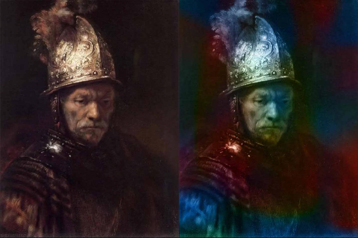
Circle of Rembrandt, The Man with the Golden Helmet, c. 1650. Oil on canvas. Gemäldegalerie, Berlin.
When values work, color follows; the values hold the picture together.
Light is a key factor in the perception of form and space. What we see is not defined by outlines, but by the way light and shadow reveal the structure of surfaces. The distribution of light across an object creates gradations of brightness, which the eye interprets as volume and depth.
These variations in brightness correspond directly to value (the lightness or darkness of what we see). Light creates value by shaping how much illumination reaches each part of a surface. Even when color is present, it is the amount of light falling on it that determines how bright or dark it appears. Value is considered one of the seven fundamental elements of art, alongside line, shape, space, form, texture, and color.
This concept was formally systematized in the early 20th century by Denman Ross, an American artist and Harvard art scholar. In 1907, he introduced what is now known as the value scale - a tool that organizes tones from lightest to darkest. This scale remains a standard reference in art education and practice today.
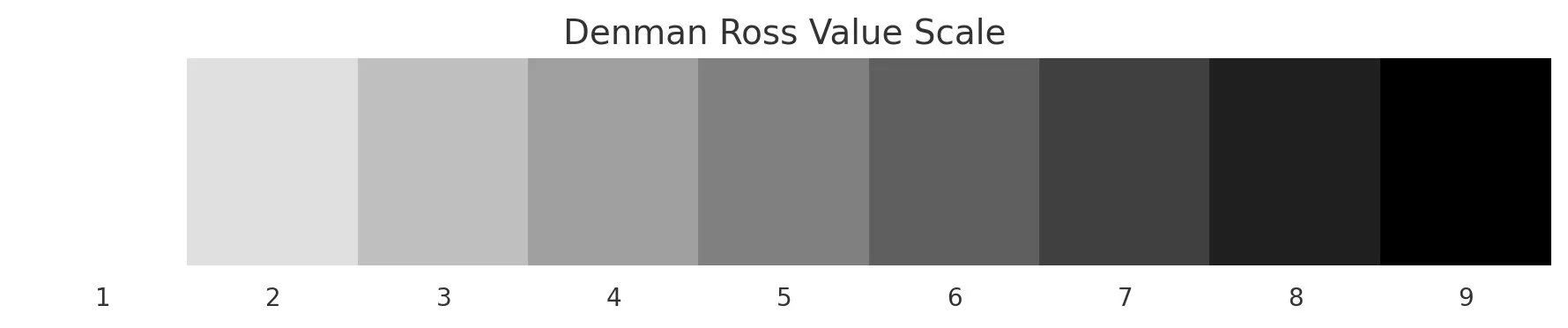
The Denman Ross value scale - nine steps from white to black.
Remember that the main things that draw the audience's attention are:
- Movement
- The brightest object
- The most saturated color
- The actors' eyes
- The element with the highest contrast in visual components
The value range of an image can help direct the audience's attention. The brightest area will usually catch the viewer's eye first(especially if there's no movement involved). Value range also plays a key role in setting the mood and emotional tone of a shot.
Look at the next image.
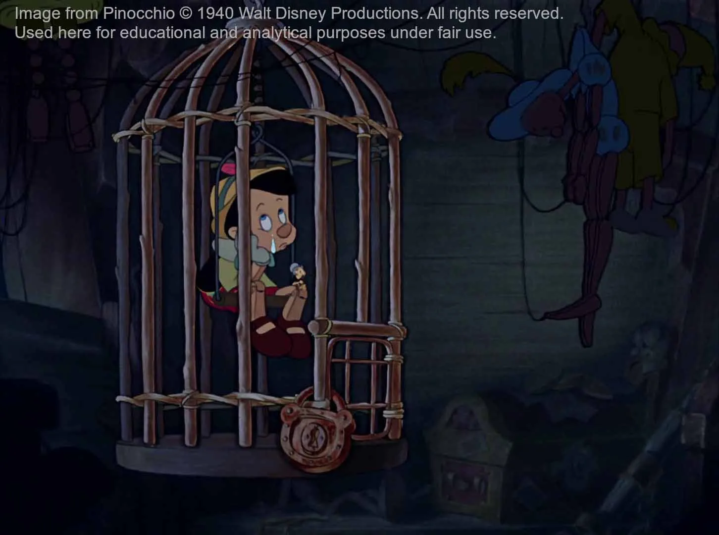
Notice how the brightest area - Pinocchio's face and eyes - immediately draws your attention.
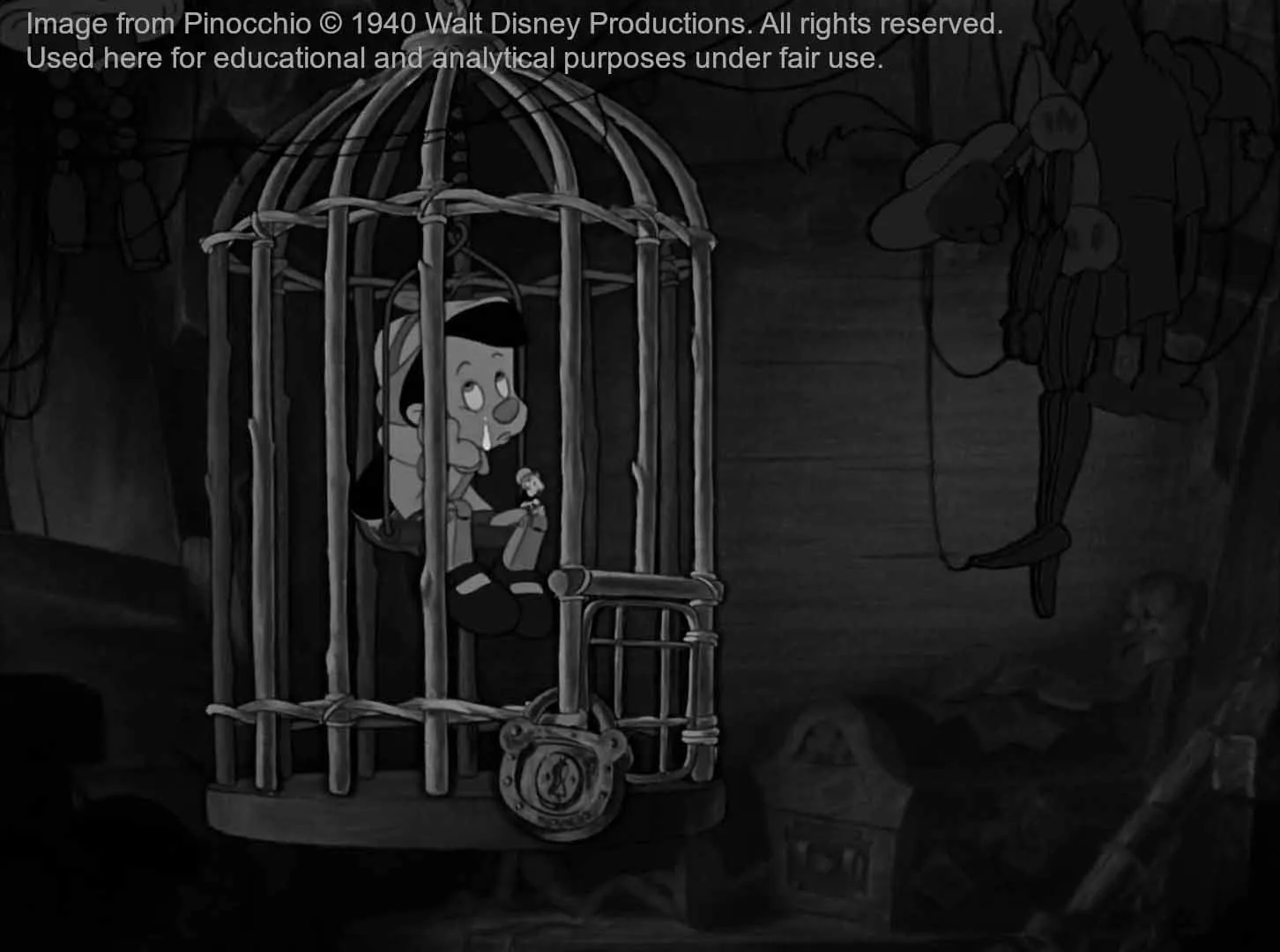
The value breakdown reveals the cage bars are also emphasized through contrast, serving the storytelling.
Where did your eyes go first? I bet it was Pinocchio's eyes. That's because, as you can see, his face(especially the eyes) is the brightest part of the image. The cage bars are also emphasized; that is a good use of value to serve the storytelling.
How Color Deceives Our Perception
A color can be described using three main attributes: hue, which ranges from 0° to 360° and determines the type of color (like red, green, or blue); saturation, which defines how intense or muted the color is; and brightness, which indicates how light or dark it appears. However, when we talk about how bright a color actually looks to the human eye, we're referring to luminance(our visual perception of brightness). While increasing a color's brightness can make it seem brighter, this isn't the whole story. That's because not all hues are perceived equally in terms of brightness. For instance, a bright yellow will always appear lighter than a bright blue, even if their brightness values are the same.
This image demonstrates how fully saturated colors differ in perceived brightness, even though they all share the same maximum saturation. Placed against a neutral gray background, it quickly becomes clear that yellow appears the brightest, followed by green and cyan. In contrast, red and magenta appear noticeably darker, with blue being the darkest of them all.
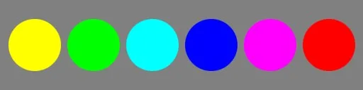
Fully saturated colors against a neutral gray background.

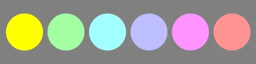
Same saturation and different value. Yellow appears brightest, blue darkest. Green and cyan sit in the mid-range of perceived brightness.
Different saturation and similar values.

Different saturation and similar values.
It is impossible to create a basic color wheel where all the hues are simultaneously of equal brightness and equal saturation. This is because different hues inherently carry different luminance values. For instance, fully saturated yellow appears much brighter to the human eye than fully saturated blue, even if both have the same saturation level in digital terms. This imbalance makes it physically and perceptually impossible to achieve a wheel in which all colors look equally bright. As a result, artists and designers must be aware of how hue, saturation, and value interact.
The Rec.709 luminance formula is used to calculate the perceived brightness of a color by assigning different weights to its red, green, and blue components. The formula is:
Y = 0.2126 × R + 0.7152 × G + 0.0722 × B Y represents luminance, and R, G, and B are the linear (non-gamma-corrected) values of the red, green, and blue channels. These specific weights reflect the human eye's greater sensitivity to green light, followed by red, and least of all to blue.
How Many Values Should We Use in Our Images?
"The fewer values the simpler and better your pictures."
Howard Pyle
Limiting the number of values in an image(typically organized into two or three broad groups)leads to cleaner, more compelling compositions. When lights are gathered together and darks remain distinct, the overall structure gains clarity, guiding the viewer's attention with intention. Working within a range of three to five value zones improves readability and reinforces the emotional weight of the image. Rather than eliminating detail, the goal is to unify similar values so that a clear visual hierarchy emerges. By simplifying the value structure, every area of light and shadow serves a purposeful role, producing a stronger and more lasting impression.
Contrast and Affinity of Value
Understanding the principle of contrast and affinity is essential to reading the visual structure of an image. Contrast describes the degree of difference between visual elements (light versus dark, large versus small, warm versus cool). While we focus on value here, this principle extends to every visual component: line, shape, color, and beyond.

Maximum contrast of value - the darkest dark against the brightest white.

Affinity of value - tones clustered closely together on the value scale.
The idea of contrast and affinity, as explained by Bruce Block, aligns closely with traditional art principles like contrast and unity. While visual arts often use terms such as harmony, repetition, or balance to describe affinity, the underlying concept is the same: contrast creates energy and attention, while affinity provides cohesion and calm. You can apply this concept to any Visual Component that creates an image (Line, Shape, Value, Color...). We'll explain it deeper in future posts.
It's quite easy to see Contrast and Affinity of Value because the gray scale let us see Value organized, maximum contrast of value would be the darkest dark vs the brightest white possible.
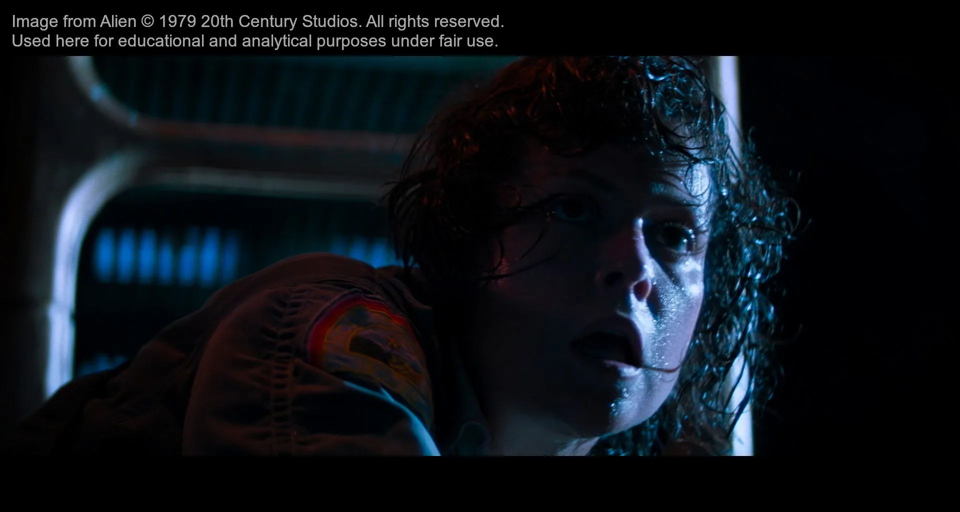
High contrast of value(and color) - creates visual energy and draws immediate attention.
The luminance breakdown shows the strong separation between light and dark areas.
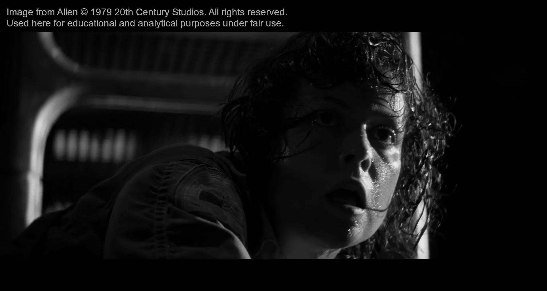
Affinity of value(and color) - similar tones create a sense of calm and cohesion.
The luminance breakdown shows how close the tonal range is, creating visual harmony.
In upcoming posts, we'll continue exploring value. How it shapes mood, guides the viewer's eye, and ultimately becomes one of the most powerful tools in a lighting artist's toolkit. Subscribe below so you don't miss what's coming next.
Meanwhile, check out my interview with Jonathan W. Rodegher on lighting, leadership, and his proof of concept André Jukebox.
Stay in the loop
New posts on lighting, art, and visual storytelling. No spam, just good reads.